CONTEXT
This project was undertaken as part of UTK's INSC 430: User Experience Foundations coursework. Our team collaborated to address usability issues in GroupMe, creating deliverables including wireframes and mockups based on contextual inquiry research.
Timeline: March 2023 - May 2023
Role: UX Designer
Client: UTK INSC 430 Course Project
Team: Rami Anguiano, Bert Dishman, Zachary Lowe, Derrick Springs
Tools Used: Figma
Product Concept Statement and Summary
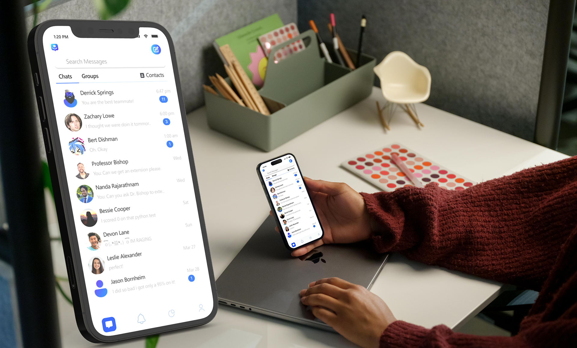
We have selected GroupMe for review as part of this assignment. GroupMe is a well-known platform used by a wide range of individuals, including students and professionals. However, the platform currently lacks compelling incentives for users due to its infrequent updates, resulting in an underwhelming user experience. Even with the most recent update, which was seemingly released just a week or two ago, there remains substantial room for improvement. Our goal is to enhance this platform by introducing new features to make it more user-friendly and contemporary. We aspire to become an indispensable part of your network, right in your pocket.
GroupMe promotes itself as "The easy way to connect with all the groups in your life, big and small." While this may have been true at some point, the rapid pace of technological advancement has left GroupMe lagging behind current standards. When compared to other communication-based apps like Discord and Slack, GroupMe falls short in terms of innovation and useful features. Its outdated messaging mechanisms provide little incentive for users to choose this platform, resulting in a lackluster user experience. From a user experience perspective, difficulties arise when attempting to send multiple photos, voice messages, and conduct conference calls. Additionally, the platform only allows for the sending of 30-second videos. It is challenging to navigate and search for specific chats or keywords within conversations. Unlike many other instant messaging apps, GroupMe lacks the ability to edit or delete messages in real time. Our objective is to enhance and modernize GroupMe's features to deliver a more fluid and contemporary user experience.
The Challenge
GroupMe, despite being a popular platform, faced several key issues:
• Infrequent updates leading to poor user experience
• Limited functionality compared to competitors
• Technical limitations (30-second videos, multiple photo sharing issues)
• Poor search functionality
• Lack of modern messaging features (editing, deleting)
Research & Discovery
The research method required by this assignment was to recruit a small group of users and to interact with the product using the Context Inquiry Method. We had a total of 7 users ages ranging from 21-49 years old.
User Search Tasks:
• Start a group and invite other participants to the group?
• How to pin and archive a chat on mobile?
Demographic Information: We have a quite diverse demographic with a collective Age range of 21 to 49 years old. The majority of our participants do have some type of experience with GroupMe, and most if not all of them got associated with the app due to School.
Interview
During the interviews most of the people being interviewed used Group me for work or school. Everyone will not be using Group Me outside of work or school. This is not the first app people use for communication. Each person that was interviewed thought that Group Me is a simple app to use. Most of the users interviewed want more customization in the app.
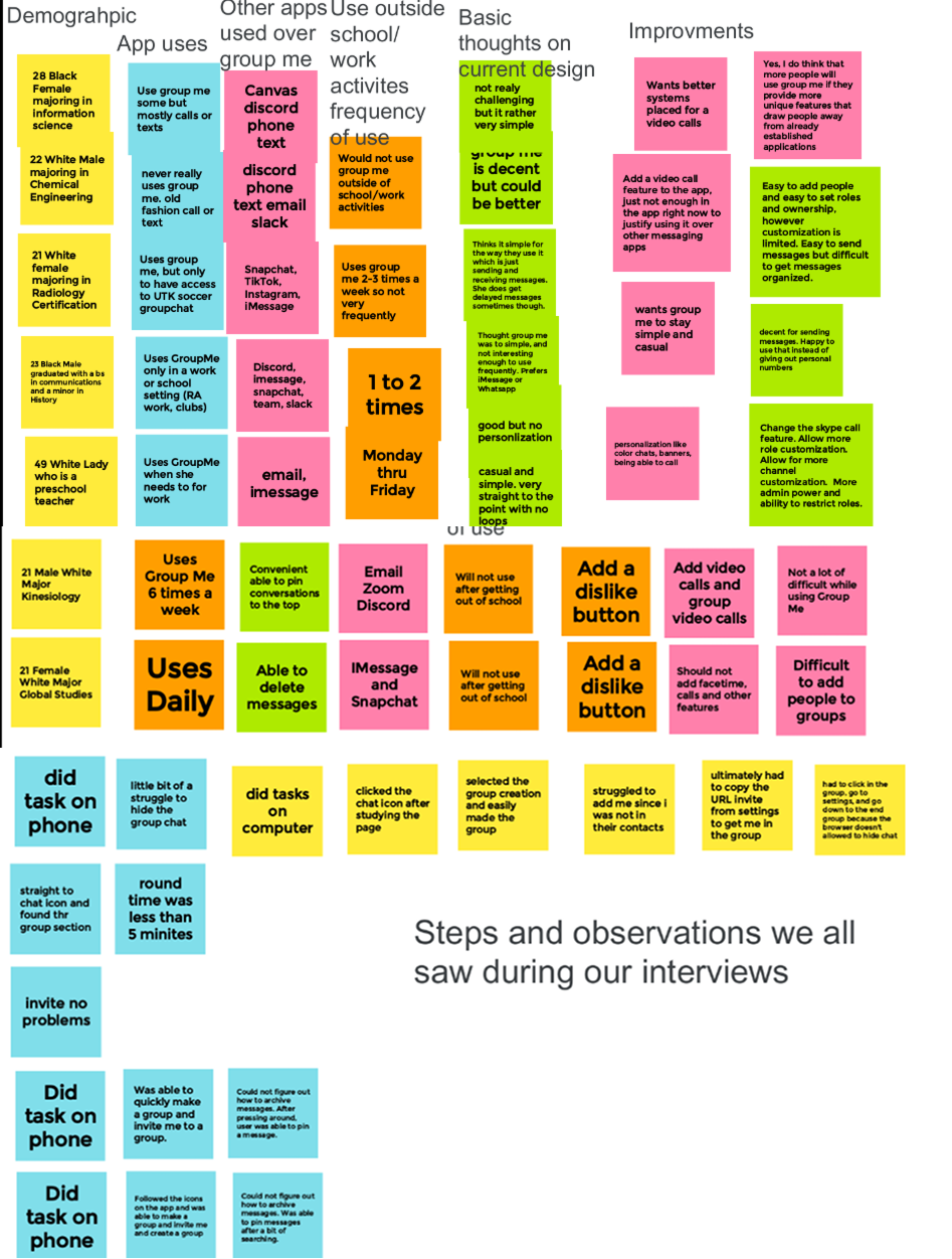
The way we structured our jam board/WAAD was in line with how we asked our participants. So demographic -> GroupMe History -> Other apps used to communicate-> uses outside school/work -> opinions on current design-> improvements. Lastly just random observations from user tasks. Ranging from the device they used to the speed of completion of the task. At first, we put all our notes onto the board and then kept the non-repetitive notes. Then to make this efficient we kept the most crucial data and organized them with certain keywords.
ANALYSIS
We consolidated user needs and extracted design requirements using specific usability heuristics.
Heuristic Evaluation Summary
We evaluated GroupMe's interface against standard usability principles, rating issues from 1 (minor) to 4 (critical).
Critical Issues
• Industry Standards Gap: Lacks modern features compared to Discord/Teams
• Error Management: Limited message editing and deletion capabilities
• System Feedback: Poor communication about updates and changes
Moderate Issues
• Memory Load: Relies too heavily on user recall vs. recognition
• User Control: Limited customization options for messages and groups
• Error Recovery: Basic confirmation dialogs but limited guidance
Minor & Cosmetic Issues
• Flexibility: Adequate basic messaging, needs improved shortcuts
• Visual Design: Dated interface lacking distinctive brand identity
• Layout: Clean but basic organization of elements
Key Recommendations
Essential Updates
• Implement modern messaging features
• Improve error prevention and recovery
• Enhance customization options
• Design Improvements
• Refresh visual identity
• Streamline information architecture
• Reduce cognitive load
Analysis
Created WAAD (Work Activity Affinity Diagram)
Conducted individual and group heuristic evaluations
Identified key usability issues
Design & Iteration
Developed low-fidelity wireframes
Created high-fidelity prototypes in Figma
Focused on modernizing features while maintaining familiarity
Wireframing


Lessons Learned
Importance of team communication in group projects
Challenge of limited UX feedback within the team
Value of external research in mobile UI design
Need for continued learning in design tools and processes