Project #03: Square Enix Games Website
Data Analysis and Usability Test Report

Introduction
Square Enix is a Japanese multimedia production company primarily focused on developing and producing video games. The company has existed in various forms dating back to the 1980's and are best known for their "Final Fantasy," "Dragon Quest," and "Kingdom Hearts" video game series. Despite the company’s typical "Japan-first" approach to their game design and marketing, the company has nonetheless steadily grown a significantly large international fanbase over the past few decades. Regardless, Square Enix does not maintain parity between its primary Japanese website and its English language counterpart. While their Japanese website is, in our opinion, slick, elegant, and consistent, we initially hypothesized that the English language website does not share those qualities. As fans of their various franchises, our team concluded that their website would be a meaningful interface for us to choose for this study.
Goals: The primary objective of our usability study was to identify and analyze user issues with Square Enix’s website. A specific focus was applied to challenges stemming from unintuitive layouts, poor content quality, and design inconsistencies across pages. Our study aimed to gain valuable insights into how users perceive the website and uncover potential pain points associated with its current design. By employing the focus- group method, participants were encouraged to vocalize their thoughts, impressions, and struggles as the website was demonstrated to them. This approach facilitated the identification of usability issues that may not have been immediately apparent through traditional quantitative research methods. By obtaining and analyzing participant vocalizations, our team was able to gather actionable feedback that can inform website improvements, enhanced user experiences, and a more consistent design across the entire Square Enix domain.
Tasks: Our study consisted of two summative, moderated focus-group sessions performed on-site and over Zoom. Rather than asking participants to do performance-based tasks within the site, we provided our groups with two semi-structured conversational prompts to discuss for multiple web pages within Square Enix’s English language domain. If the discussion was struggling or if insufficient data was collected, the moderator provided participants with more pointed prompts to respond to. The tasks were as follows:
• Task 1: View the Home page of Square Enix’s website and discuss the following:
○ What do users think of the content on the home page?
○ What do users think of the organization / aesthetics of the home page?
• Task 2: View the Store page of Square Enix’s website and discuss the following:
○ What do users think of the content on the store page?
○ What do users think of the organization / aesthetics on the store page?
• Task 3: View the Games page of Square Enix’s website and discuss the following:
○ What do users think of the content on the game page?
○ What do users think of the organization / aesthetics of the game page?
• Task 4: View the Help page of Square Enix’s website and discuss the following:
○ What do users think of the content on the help page?
○ What do users think of the organization / aesthetics of the help page?
Data
Individual Data Collection
I collected qualitative information from participant responses during the Group 1 study. The data was derived from observer notes documented in Microsoft Word and session videos stored in Google Photos. Organization and management of the data was facilitated through the use of an Excel sheet.
Hunter Sexton analyzed the pre and post surveys. The surveys included both qualitative and quantitative data. Quantitative data was averaged and arranged while the qualitative data was open-coded by keywords. The surveys were collected through two methods: Group 2 (Zoom) utilized a Google survey form while the in-person group filled out printed surveys with pencils.
Duncan Clark collected data by recording Group 2’s Zoom session. After analyzing the recorded session, Duncan dictated the verbatim statements made by participants and highlighted the most significant, meaningful phrases which were then encoded into keywords using Microsoft Word. After collecting the keywords, they were sorted into a Google Sheets spreadsheet and assimilated with the keywords obtained from Group 1. Conclusions on these findings were then analyzed and recorded into this document.
Group Data Collection
As a group, our team split up the results from our tests into data chunks that we could easily analyze. The data chunks consisted of our pre and post survey results as well as the recorded tasks from both test sessions.. Group 1 and Group 2’s data were then consolidated into a single Google Sheets document. The quantitative data collected from the surveys were converted into percentages.
Our team monitored for unique user statements vocalized within each focus group. We utilized open keyword coding to break down unique descriptive words in two ways: The first method employed categorical sorting and the second method utilized a binary positive or negative system for sorting. From our findings, we were able to identify seven primary categories that our comments all fell into. Those categories and their criteria are listed below:
• Readability: Comments in this category were based on legibility, font selection / size, and the visual accessibility of the site.
• Layout: Comments in this category were based on the organization of elements presented on the screen.
• Content Quality: Comments in this category were based on relevancy of content and depth of information provided.
• Design: Comments in this category were based on typography, general clarity / display of information, and other deliberate elements in regards to appeal.
• Consistency: Comments in this category referred to design elements that were not uniform across pages within the domain.
• Aesthetics: Comments in this category were based on artistic elements such as use of space, contrast, theme, and colors.
• Missing Content: Comments in this category were based on any instance a user mentioned that they did not see/ find specific content that they expected/ wanted to find.
Task Success: Task success and failure was determined at the discretion of the moderator. When the moderator felt that the task was successful in getting meaningful feedback, they would then proceed to the next task. If the moderator felt that insufficient feedback had been obtained from participants, then they had the option to follow up the initial prompt with additional discussion topics. No tasks resulted in a failure in either test group.
Findings
SURVEY
• Demographic:
○ 50% of our participants self-reported that they play video games daily.
○ 25% of participants play video games weekly.
○ 25% of participants play video games monthly or less.
○ 25% of our participants were unfamiliar with Square Enix as a brand.
• Pre-Survey:
○ Users stated that their primary motivation for visiting a game publisher’s website would be to obtain information about their games, particularly for details such as release dates, ratings, and reviews. Additionally, users were interested in viewing gameplay footage.
• Post-Survey:
○ Every user expressed dissatisfaction with the overall design of the Square Enix website. When asked if the website was aesthetically pleasing, nearly every respondent answered negatively with the exception of the 16.7% of participants that held a neutral stance. Users found the content of the website to be of poor quality and too disorganized to efficiently parse through.
TASKS
Our team identified seven primary areas of focus that our participants' comments correlated with, which are: readability, layout, content quality, design, consistency, aesthetics, and missing content. Notably, the "layout" category received the most attention from participants. A significant 89% of comments regarding the site’s layout expressed a negative sentiment. Overall, 83% of all comments about the site conveyed a negative sentiment.

Usability Problems
Our task based findings were seen across each task; moreover, our problem statements are holistic and not task based. We have included screenshots from unique tasks to showcase the issues we have identified.
Primary Usability Problems:
• Layout
• Content Quality
• Aesthetics
TASK I: Homepage
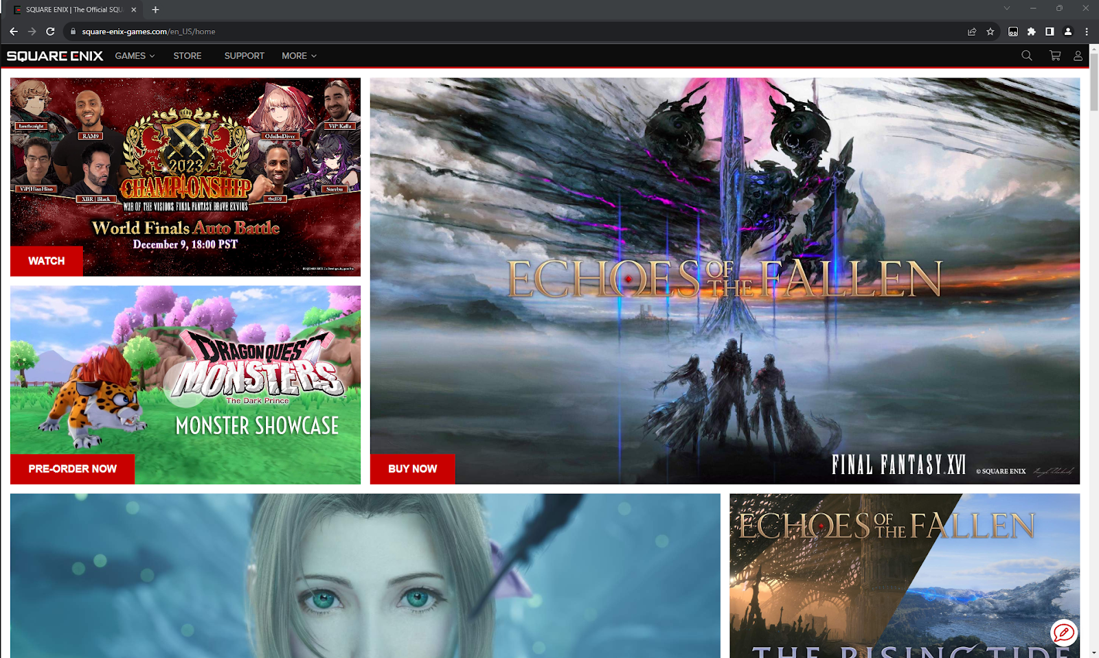
Cluttered, inconsistent layout without a clear purpose or organizational uniformity for the various elements.
Usability Problems: Square Enix’s homepage demonstrates participants’ frustrations with the presentation and layout of the website’s design. From the feedback we received, participants were confused by the layout, making statements such as “...it’d be better on a touchscreen…there’s a lot going on,” “Definitely overwhelming,” and “They shouldn’t have so many parallel streams competing for my attention.” Additionally, participants had major issues with the presentation, making statements such as “It gives me a headache,” and “There’s no uniformity to the icons.“ 89% of participants had a negative comment to say about the layout.
Potential Solution: Apply a more streamlined and organized layout by categorizing content, utilizing clear headings, and employing a uniform grid system. This adheres to Hick’s Law as well as Donald Norman's design principle of "Visibility," making information more accessible and reducing cognitive load.
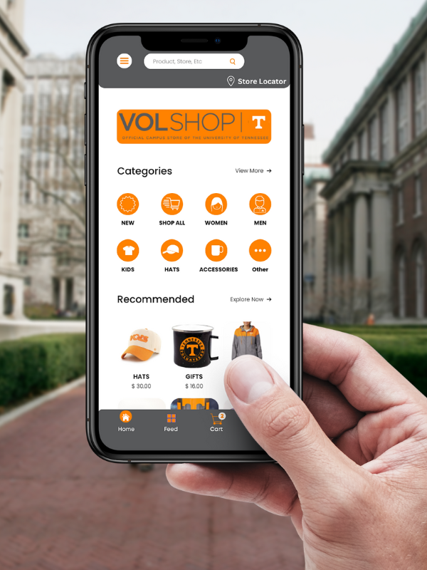
Task ii: Store Page

Lack of content / features expected by users and an unintuitive layout.
Usability Problems: Square Enix’s store page lacks fundamental functionalities that our participants expect from an online games-related storefront. Multiple users made statements such as “I expected to see ratings and reviews,” and “Is there not a sales section?” Additionally, participants took issue with the layout of the page, stating, “It’s weird that they have action figures above the actual games if they’re a game company,” and “There’s way too much whitespace…the images don’t take up enough of the screen so it’s just empty and blinding white.” 94% of participants had negative statements about the store page (drawn from content quality and missing content categories).
Potential Solution: Move relevant and popular items towards the top for better visibility and accessibility. This aligns with the Gestalt principle of hierarchy and Norman's "Visibility" principle, which posits that placing crucial content prominently enhances user comprehension and engagement. Optimizing information placement streamlines navigation, reducing cognitive load for a more intuitive and user-friendly digital experience. This emphasis on visibility is pivotal for enhancing user understanding and interaction.
Task iii: Help Page
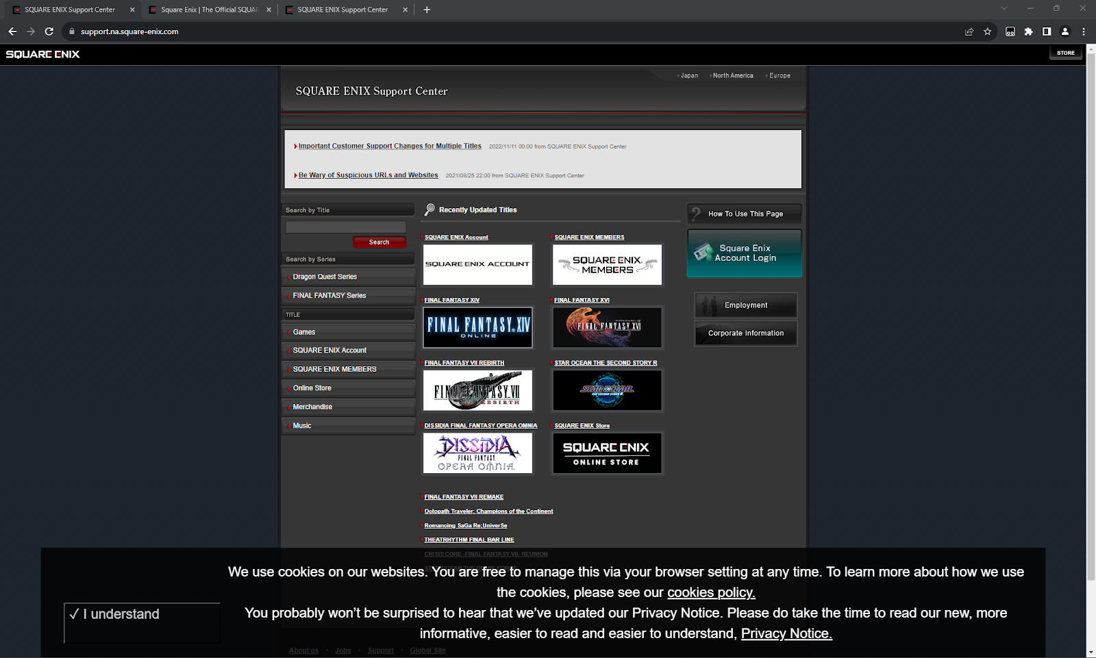
Users are unimpressed with the outdated user interface and poor navigability.
Usability Problems: The aesthetics of the Square Enix Support Page are exceptionally outdated and do not meet modern design standards and guidelines. Participants made statements such as, “It looks like someone’s blog,” “It feels abandoned,” and “It looks like an in-house tool that an employee should be using and I’m, like, not supposed to be here.” One participant even said, “It’s pretty terrible.” Outdated aesthetics can negatively impact user perception, making the page appear unprofessional and potentially hindering trust and usability. 80% of users made negative comments about the help page’s aesthetics.
Potential Solution: Update the page's design to align with modern design standards, focusing on a clean and user-friendly interface. Consider implementing a contemporary color scheme, legible fonts, and an intuitive layout. Updating the design adheres to design principles such as "Aesthetic-Usability Effect" by Donald Norman and Jakob Nielsen's "Aesthetic and minimalist design" heuristic. A modern, visually pleasing design not only enhances user satisfaction but also boosts trust and overall usability. Tailor specific design decisions to the website's context and target audience.
Unexpected Issues, Challenges, and Alternatives
Unexpected issues
Our team encountered various challenges in assembling a diverse participant pool for our focus group, primarily due to scheduling constraints and impending deadlines. Within the testing phase, an unexpected issue surfaced when a survey was found to be missing a page. Fortunately, the participant identified the omission, and we promptly provided an alternative backup survey. However, during the analysis of the surveys, a distinct challenge emerged as some participants left responses that were excessively vague, left unanswered, or misinterpreted the questions, hindering the accuracy of data collection.
As previously mentioned, our group encountered difficulties scheduling participants due to time conflicts, necessitating the implementation of an alternative testing plan. The initial plan faced challenges, leading us to devise an alternative plan to resolve scheduling conflicts.
Additionally, we had a team member drop out of the project suddenly and unexpectedly. This impacted morale and increased the workload that each remaining member had to take on.
Alternative Plan for Testing
In the event that the original testing plan was infeasible, remote usability testing was to take place. Group 2’s alternative test was conducted through Zoom and its data collection / survey completion was done with the aid of Google Forms. As with the original plan, our alternative test consisted of a focus-group with six participants. The moderator guided participants through the test and the observer took notes much as Group 1 did. The audio and video feed of the Zoom meeting was recorded in its entirety, as consented to by participants..
Personal Contributions and Effort
Testing:
Regarding testing, my responsibilities encompassed managing the entire paperwork process, which included printing, distributing, collecting, and uploading our group's consent forms, pre-questionnaires, task-related documents, and post-questionnaire papers. Additionally, I played a role in recruiting participants for our group. I reached out to many potential participants, and I was fortunate to have the support of Hunter Sexton in finding one more participant. I actively participated in coordinating team meetings and establishing testing schedules. Moreover, I collaborated with the team to review and seek clarification on various aspects, contributing to the refinement of items such as the printable instruments.
In terms of deliverables, I took on writing formatting the observer/ moderator checklists and aiding in writing the recruiting participants section. As well, I participated in peer-reviewing all sections.
Final Report:
In the final deliverable: I assumed the responsibility of coding the video responses for group one in the focus group, investing roughly three hours in watching and encoding the content. The time length of the total video that I had to watch was around 1 hour and 9 minutes. Furthermore, I authored the majority of the "Unexpected Issues, Challenges, and Alternatives" and the “Usability Problems” section. I also participated in the data collection efforts with my group, involving time for discussions and analysis. Additionally, I contributed to formatting and actively engaged in peer reviewing the entire project. Lastly, I helped prepare for our presentation.
Overall Reflections
My encounter with usability testing proved insightful, highlighting the meticulous nature of tasks such as recruiting participants and the time-intensive aspects of coding and analyzing findings. I gained an appreciation for the complexities involved in the process. While I found the experience intellectually rewarding, the time-consuming aspects of coding were less enjoyable. In future analyses of usability testing data, I plan to streamline coding processes and allocate time more efficiently, aiming to enhance overall productivity and derive more actionable insights.
Another point was how grateful I was to have teamed up with Hunter and Duncan. My collegauges willingless to talk and delibrate made this project incredibily more easier and Hunter did a fablous job in conducing the actual test and had a great balance of guiding users without trying to bias them.
References
Barnum, C. M. (2010). Usability testing essentials : Ready, set... test!. Elsevier Science & Technology.
Norman, D. A. (2021). The design of everyday things. Basic Books.
The Official Square Enix website. SQUARE ENIX | The Official SQUARE ENIX Website. (n.d.). https://www.square- enix-games.com/en_US/home
Office of Research, Innovation & Economic Development. (2022, December 14). HRPP Forms and Templates. Research Integrity & Assurance. https://research.utk.edu/research-integrity/human-research-protection- program/for-researchers/hrpp-forms-and-templates/
World Leaders in Research-Based User Experience. (n.d.). Heuristic evaluations: How to conduct. Nielsen Norman Group. https://www.nngroup.com/articles/how-to-conduct-a-heuristic-evaluation/